Everything needed to represent Effortless Admin consistently - in a deck, a campaign, a carrier lockup, or a product screen. Use it as the single source of truth.
Our promise, and the test every asset has to pass.
Carrier-agnostic by design
Our mark often sits beside a partner's. Pair them as equals.
Made in Canada, SOC 2 Type II
Two facts worth stating plainly wherever they are relevant.
The universal benefits administration platform
Effortless Admin is Canada's leading ben admin solution - a third-party administrator where the most advanced benefits technology meets knowledgeable human service.
Through a single, intuitive platform we manage the full benefits lifecycle, from digital onboarding, eligibility and managed processes to HCM integrations, carrier data transmission and billing, across any carrier or combination of carriers an employer chooses. We are carrier-agnostic by design, eliminating complexity for HR teams, advisors and employees alike.
We are SOC 2 Type II certified, so client and employee data is handled to rigorous, independently-audited security standards.
Carrier-agnostic
Full lifecycle
Enterprise-grade tech
Human service
SOC 2 Type II
Made in Canada, for Canada
Our promise
Automation backed by real people.
Seven values, one promise
Every asset we make should feel as effortless as our name. These are the values it should carry.
1
Effortless Experience
If it feels complicated, we haven't finished the job. Effortless is a promise.
2
In Service to Others
People aren't obstacles to our work, they're the point of it.
3
We are Innovators
Problems don't intimidate us, they energize us.
4
We Speak Up
We hand people a head start, not just a problem.
5
We Own Our Mistakes
Own it, learn from it, move forward.
6
We Band Together
No task is beneath any of us. Shoulder to shoulder.
7
Everyone Succeeds
Success isn't finite; it multiplies when shared.
Above all
Live the promise
Every asset we make should feel as effortless as our name.
Voice & tone
We sound like a knowledgeable colleague, not an insurance document. Four traits carry every piece of copy.
Clear
Plain language over jargon. We make the complex feel simple.
Confident
We live and breathe benefits and it shows, without boasting.
Warm
Human, approachable, never cold or corporate. There's a person here.
Helpful
We hand people a head start with context, options, next steps.
We say
“We'll handle the carrier coordination - you'll have one point of contact.”
“Here's exactly what changes on your next bill, and why.”
“Great question for your advisor - want me to connect you?”
!We avoid
“Please be advised that the aforementioned adjudication is pending.”
Dense insurance jargon with no plain-language explanation.
Overpromising on things outside our scope (claims, plan design).
Naming & nomenclature
How to write our name in running copy - the logo's closed-up styling never carries into text.
Writing our name
Correct:Effortless Admin- two words, both capitalized, in all running text
Correct:Effortless- acceptable on its own; fine to refer to us without “admin”
Correct:EA- internal use only; spell it out in client-facing copy
Incorrect:EffortlessAdmin - the closed-up styling is for the logo only
Incorrect:EFFORTLESS ADMIN - no all-caps in body copy
Short forms
Effortless Admin, or simply Effortless.
Both are approved in copy. Keep “EA” for internal use, and spell the name out in client-facing material.
Trademark
Use the ® on first or most prominent mention
Apply the registered mark on the logo and the first key mention in formal and marketing materials, not on every instance in body copy.
The logo
The full logo, combining the swoops mark and wordmark, is our signature. Use it as the default wherever space allows, and always scale from the master artwork.
Master artwork · SVG / EPS / PNGMinimum size 200 px wide on screen · about 2.1 in in print
Clear space & minimum size
Reserve clear space on all sides equal to the height of the lowercase “a” from our wordmark - which is half the height of the swoops mark.
Keep type, imagery and hard edges out of this zone.
Minimum size: 200 px wide on screen - about 2.1 inches wide in print.
Always scale from the master artwork - never redraw, restretch or rebuild the logo.
The swoops mark
The three swoops can stand alone as an icon - for avatars, favicons and graphic accents - but only where the connection to Effortless Admin is already clear.
On light backgrounds
Avatar & favicon lockups
Logo on backgrounds
On white - preferred
On dark - reversed
On light tint
Logo misuse
✕Don't rotate the logo
✕Don't stretch or distort
✕Don't use on clashing colour
✕Don't recolour the swoops
✕Don't add shadows or effects
✕Don't place on busy backgrounds
Co-branding & lockups
Because we are carrier-agnostic, our logo often appears beside a carrier or partner. Pair them cleanly so the two read as equals, and never merge them into a single mark.
Divider · vertical rule
Partner / carrier logo
Multiplication · × mark
Partner / carrier logo
Separate the two logos with a thin vertical rule, or a large fine-lined × that signals we are stronger together.
Leave at least one “a” of clear space on each side of the separator.
Balance by visual weight, not literal height, so the partner logo feels equal, not larger.
Keep both logos in their approved colours; never restyle, recolour or merge either mark.
Colour
Blue leads. Green and gold energize and support. Black grounds all text and structure.
Primary
Effortless Blue
HEX
#27A5DD
RGB
39 · 165 · 221
CMYK
82 · 25 · 0 · 13
PMS
299 C · 2995 U
Support
Effortless Green
HEX
#70BE44
RGB
112 · 190 · 68
CMYK
41 · 0 · 64 · 25
PMS
360 C · 368 U
Accent
Effortless Gold
HEX
#FAAF42
RGB
250 · 175 · 66
CMYK
0 · 30 · 74 · 2
PMS
1365 C · 129 U
Text
Effortless Black
HEX
#181923
RGB
24 · 25 · 35
CMYK
31 · 29 · 0 · 86
PMS
Black 6 C
Pantone values (coated & uncoated) are nearest matches - confirm with your printer for critical print work.
Accessibility
Put dark ink on the brand colours. For coloured text on white, use each colour's Text shade below.
Ink on BlueContrast 6.3 : 1 AA ✓
Ink on GreenContrast 7.6 : 1 AA ✓
Ink on GoldContrast 9.4 : 1 AAA ✓
White on BlueContrast 2.8 : 1 Avoid ✕
Neutrals
Ink#181923
Slate#5B5D66
Steel#9A9CA4
Cloud#CFD2D8
Line#E7E8EC
Mist#F5F7F9
Blue Tint#E8F6FC
Core colour shades
Base is the brand colour - the only value that maps to Pantone and appears in the logo. Tints and shades are for backgrounds, UI states and accessible text only.
Primary
Effortless Blue
Tint#E8F6FC
Soft#7FCBEA
Base#27A5DD
Deep#1C84B3
Text#145F80
Support
Effortless Green
Tint#EEF8E9
Soft#A9D98A
Base#70BE44
Deep#559A32
Text#396222
Accent
Effortless Gold
Tint#FDF4E6
Soft#FCD08A
Base#FAAF42
Deep#D98E17
Text#7A4E0C
Extended palette
Two optional colours drawn from outside the logo. Never use them on the logo or primary brand moments.
Expressive accent
Violet
For charts, illustrations, callouts and highlights - adds energy without competing with the brand blue.
Tint#EFEAFC
Soft#A98FEE
Base#7A5CE0
Deep#5A3FC0
Text#4E36AE
Signal & accent
Red
Primarily for errors, critical flags and “action required”; may be used lightly as an accent. Its rarity is what makes it work.
Tint#FDECEC
Soft#EF8F95
Base#DA2C3A
Deep#C21F2C
Text#B01722
Type system
Two open-source faces (SIL OFL) - use via Google Fonts or self-host.
Plus Jakarta Sans
Headings · Display
Aa Bb Cc 0123456789
Inter
Body · UI · Captions
Aa Bb Cc 0123456789
Fallback stacks: Plus Jakarta Sans → Segoe UI → system-ui for headings, Inter → Arial → system-ui for body.
Tracking: tighten large headings (−0.02em); keep body and small text at 0. Weights: 400 body · 500 labels · 600–700 headings.
Display · 46 · 700Benefits, effortless
H1 · 40 · 700One platform, any carrier
H2 · 28 · 600Enterprise-grade technology
H3 · 20 · 600Knowledgeable human service
Body · 16 · 400Enterprise technology, human service.
Eyebrow · 12 · 600Who we are
Icon style
We draw all icons from Font Awesome - one comprehensive, consistent, easy-to-source library. Use the line style for everyday interface icons, and duotone for feature icons.
Line - everyday interface icons
Duotone - feature icons
Line by default
Font Awesome line (regular or light) weight for interface icons. Never solid fill.
Duotone for features
Font Awesome Duotone for feature highlights: a solid brand layer over a soft tint.
Brand colour
Draw in Effortless Blue; ink on light, white on dark. Clear over clever.
Imagery & graphics
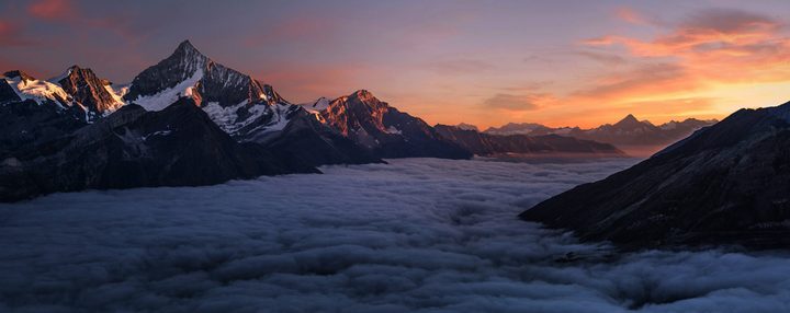
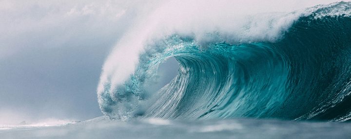
Our look has two halves: grand Canadian landscape photography, and a system of geometric line backgrounds in our brand colours for everything else.
Photography - Canadian landscapes
Grand · Natural · Atmospheric
Geometric backgrounds - for everything else
Any brand colour + gradient
Hex grid · Blue
Isometric · Violet
Radial · Blue
Contours · Green
One repeating line motif, many colourways. Tint the pattern with any primary or secondary colour over a soft gradient of the same family. Keep it low-contrast and behind content - a texture, never the message.
The swoops as a graphic device. Beyond the logo, the three swoops can flow across covers and banners as a signature accent - cropped generously and kept to brand colours.
Need source files or a template?
Logo artwork, colour tokens, deck and document templates are available on request.